

The responsive revolution has seen a host of tools hit the web. Here are five tools that will assist with going responsive.
What is the future for responsive design? I think it’s reasonable to say that RWD is well on its way to becoming the norm, rather than just an interesting trend adopted by the creative elite. The growth of the mobile device as a primary portal for web use has, in many ways, forced the hand of designers and developers and this can only be a good thing.
The variety of free responsive boilerplates currently available, and their ease-of-use, makes arguments about the extra cost and time consumption of responsive building far less convincing than they once were. Arguments now need to be presented to justify not making a site responsive. Future-proofing is a must.
WordPress have recently adapted their base themes to a responsive layout, more and more sitebuilder services are offering responsive templates, and eCommerce platforms such as Magento are also increasing their stock of responsive themes. RWD has entered the mainstream and is here to stay. How long before fixed-width sites begin to seem aged and out-of-touch?
Five tools | Go Responsive | Build your own Website
01. Bootstrap
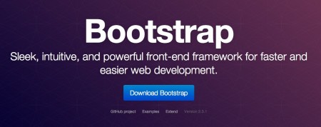
Powerful front-end framework for quick web development. Built at Twitter by @mdo and @fat, Bootstrap utilizes LESS CSS, is compiled via Node, and is managed through GitHub to help nerds do awesome stuff on the web. Bootstrap was made to not only look and behave great in the latest desktop browsers (as well as IE7!), but in tablet and smartphone browsers via responsive CSS as well. A 12-column responsive grid, dozens of components, JavaScript plugins, typography, form controls, and even a web-based Customizer to make Bootstrap your own.
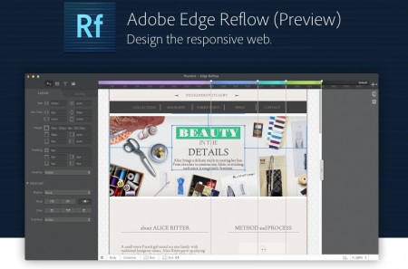
Create responsive layouts via an intuitive user interface. Creating responsive designs is a snap with the visual and interactive user interface in Edge Reflow. Ease the pain of designing for multiple screen sizes by using a resizable design surface and media query breakpoints. Create awesome designs using CSS like never before. The native web surface in Reflow provides the precise and intuitive controls you need to turn your vision into reality. Preview and share designs in your browser or on a device thanks to integration with Edge Inspect. Easily extract CSS from your project for further development in Edge Code, Adobe Dreamweaver, or another code editor of your choice.
03. Reverie
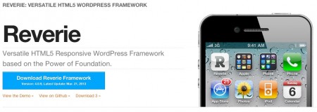
Reveries is an HTML5 responsive WordPress framework based on the Foundation framework. Reverie Framework is an extremely versatile HTML5 WordPress framework based on ZURB’s Foundation, a powerful tool for building prototypes on any kind of devices. Reverie follows HTML5 Boilerplate standard and is hNews microformat ready. It is optimized for Search Engine while at the same time improve readability. It is extremely easy to create your blog, CMS, brochure and any other kind of sites with Reverie. You can see some samples on ZURB and how they make these prototypes. Did I just mentioned Reverie works well with bbPress 2.0 and BuddyPress 1.5, even without styling?
04. Isotope
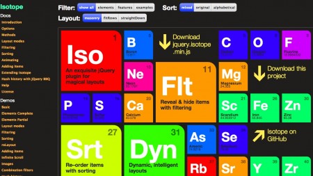
This clever jQuery plug-in is designed to rearrange your webpage content to fit all screen sizes. Layout modes: Intelligent, dynamic layouts that can’t be achieved with CSS alone. Filtering: Hide and reveal item elements easily with jQuery selectors. Sorting: Re-order item elements with sorting. Sorting data can be extracted from just about anything. Interoperability: features can be utilized together for a cohesive experience. Progressive enhancement: Isotope’s animation engine takes advantage of the best browser features when available — CSS transitions and transforms, GPU acceleration — but will also fall back to JavaScript animation for lesser browsers.
05. Style Tiles
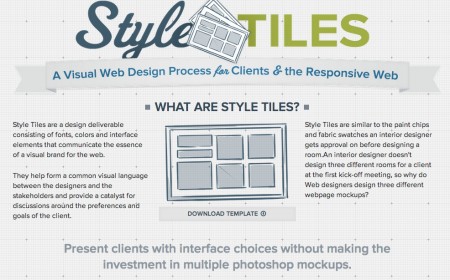
This template enables you to create a quick visual presentation of site elements and design. Style Tiles are a design deliverable consisting of fonts, colors and interface elements that communicate the essence of a visual brand for the web. They help form a common visual language between the designers and the stakeholders and provide a catalyst for discussions around the preferences and goals of the client.